
Warm and Cool Colors
A way to divide and perceive colors in art
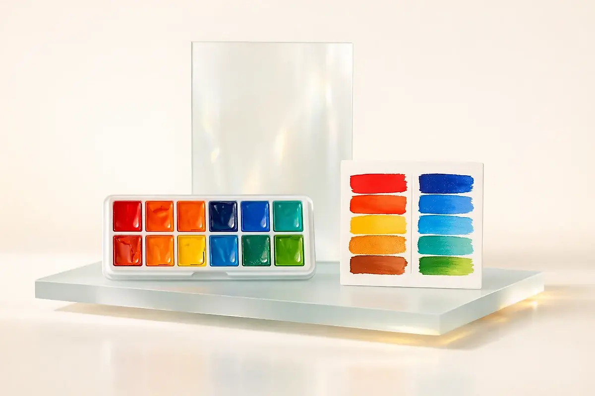
Warm and cool colors are one of the most important tools for an artist. They help control the mood of a painting, conveying a sense of space, light, and emotion. Warm shades—reds, oranges, yellows—create a feeling of closeness, energy, and vibrancy. Cool shades—blues, greens, purples—on the other hand, push back, giving calmness and coolness.
Artists of the Renaissance already deliberately used this effect: warm foregrounds and cool distant planes enhanced the sense of depth. In Impressionism, it became a key technique: Claude Monet and Camille Pissarro experimented with combinations of blue shadows and golden light, creating color vibration.
Advice to artists: if your work lacks life, try introducing a color opposite in tone. Even a slight change in temperature makes the composition more dynamic.